
FIELD SYSTEM
A visual identity built as a system.
Field System explores identity as a framework rather than a fixed mark. Built from simple geometry, controlled proportion and a restrained material palette, the system is designed to remain recognizable across scales, surfaces and applications.
The project began with a basic question: how little information is required to create a distinct visual identity?
The result is a modular language of form, typography, spacing and material that can move from a small printed mark to packaging, publications, environmental graphics and physical objects without losing its character.
Scope
Identity / Visual System / Art Direction
Project
YL-BD / 001
Year
2026
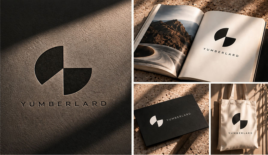
CONCEPT
One circle. Two forms. One system.
The symbol begins with a circle divided around a common center point.
Rather than treating the circle as a finished icon, portions are removed to create two opposing forms. The upper-left element occupies a 135° sector, while the lower-right element occupies a 90° sector, establishing an intentional imbalance within an otherwise precise circular construction.
The remaining negative space becomes as important as the solid geometry. What is absent creates direction, tension and movement.
The result is a mark that feels mechanical and constructed while remaining open to interpretation.
CONCEPT SKETCHES
Finding the form through reduction.
Early studies investigated the relationship between circle, sector, rotation and negative space.
Variations were drawn against a consistent geometric framework, testing different divisions of the circle and different relationships between the two remaining forms. Small changes in angle produced significant changes in balance, direction and visual weight.
The process gradually eliminated unnecessary geometry until the symbol could be described by a small set of repeatable mathematical rules.
Circle / Division / Removal / Balance


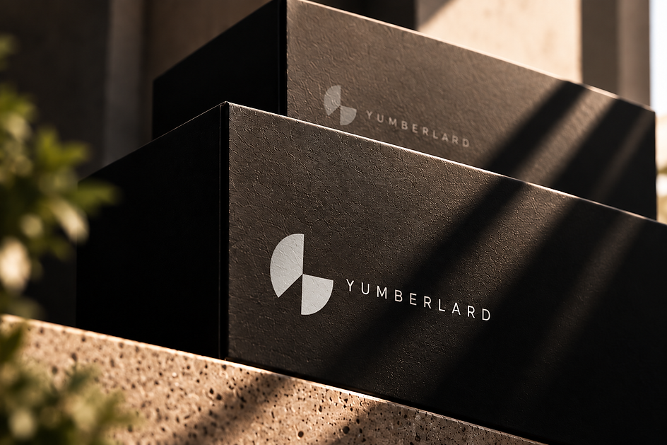
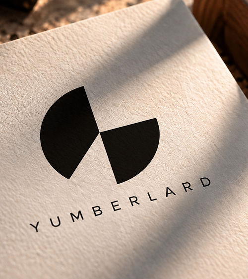
A framework for whatever comes next.
Field System reduces the identity to a small number of deliberate decisions and gives those decisions room
to expand.
From a mathematically constructed symbol to typography, printed matter, packaging and environmental applications, each element belongs to the same underlying logic.
The system is designed to remain precise without becoming rigid—and recognizable without needing to repeat itself.
Identity. Strategy. Communication.


